Dash Apps: Connectivity Viewer
We have released a new public version 1822, as part of our quarterly release schedule. See details at Release Manifests: 1822.
Tutorials will be updated from v1412 in the coming weeks
We have created two webapps to help explore and visualize the data. These apps were created using the Dash framework, hence the name.
Connectivity and Cell Type Viewer
The Connectivity Viewer is designed to let you glance at the synaptic output or input of a given cell and group connectivity by cell type or other annotations.
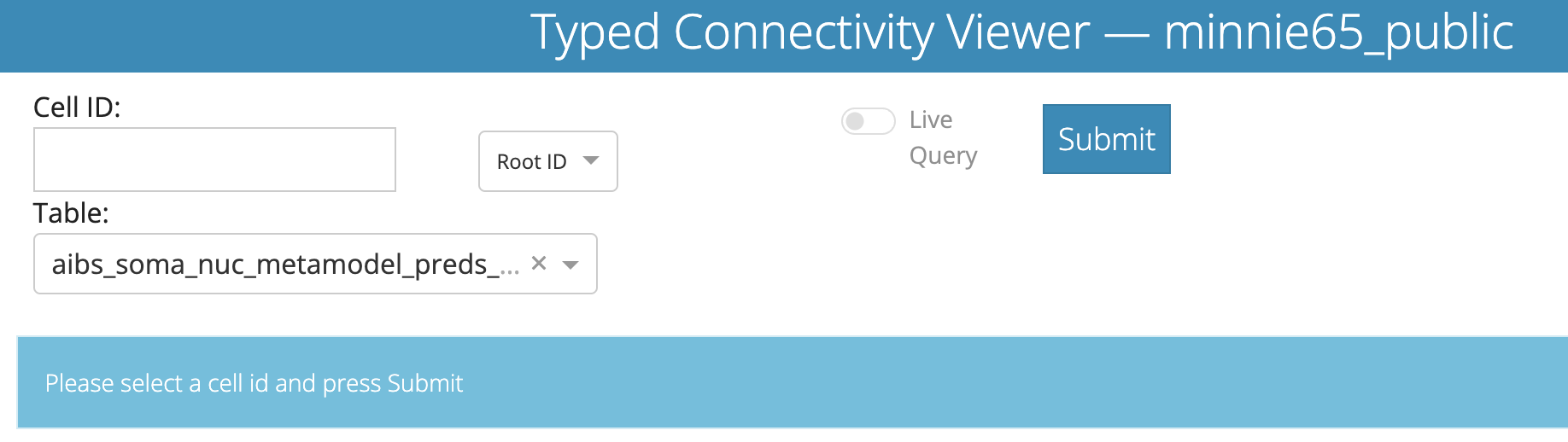
Along the top, you can enter an Cell ID (either a root ID or a cell ID) and, optionally, a table to use to define cell types for synaptic partners.
Note that if you want to use cell IDs from the nucleus detection table, you must select the Nucleus ID option from the dropdown next to the entry box.
The Materialization option allows you to select which version of the dataset to query from. Default is ‘latest’.
For the optional Table dropdown, there are several tables to choose from, though the most informative will be one of the cell type classification tables. The aibs_metamodel_celltypes_v661 has the greatest coverage of the dataset, and is described in Perisomatic ultrastructure efficiently classifies cells in mouse cortex” (Elabbady et al. 2025).
The table aibs_metamodel_mtypes_v661_v2 is the most current version version of the cell type classification, described in “A connectomic census of mouse visual cortex” (Schneider-Mizell et al. 2025).
Pressing “Submit” will query the database for the cell and its synapses.
Once completed, you will see the bar under the input options turn green and report the data that it is displaying. You may get one of several outputs depending on the root id you use.
For example, if we query root id 864691135408247241 at version 1412, we will see the following:

Meaning the server looked up the correct root id for the selected materialization version. If you DO want the connectivity for the expired root id, you mus select the materialization version for when it was extant.
When you use a current root id or nucleus id, you will see the following return message

Importantly, the data displayed below will match whatever is in this bar — if your query takes a long time or fails for some reason (i.e.bad internet, server error), the tables displayed might be stale.
There are two locations the resulting data is displayed, as we’ll see below.
- First, a bar of tabs allows you to quickly visualize the data in different ways.
- Second, the table can present synaptic partners in a more detailed way.
Visualization tabs
The first and default option in the tabs is Tables Only which doesn’t actually show any data. This is merely a placeholder to let you look directly at the tablular data below.
The next tab, Plots lets you visualize the synaptic output of a neuron.
We focus on synaptic output only right now, because the data quality is such that automated dendritic reconstructions are reliable, but automated axon reconstructions are not (see Proofreading section). Because of that, if a neuron has been proofread we trust the cell types of its postsynaptic partners as a group but do not trust the cell types of its presynaptic partners.
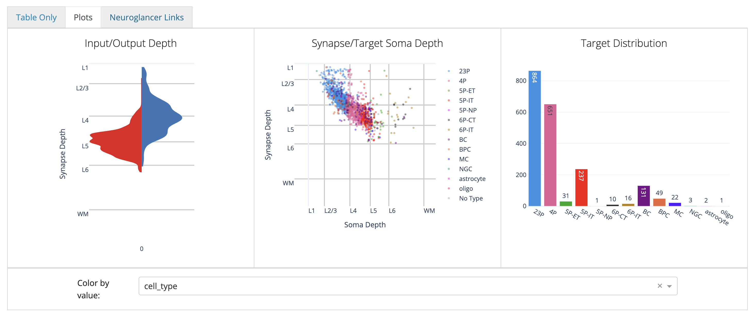
These plots are designed to give you a quick overview of a cell’s synaptic outputs.
To add a particularly cell type column, use the Color by value: dropdown below the row of plots to select a column to color by.
These plots are handled in Plotly, so you can hover over the plots to see more information, and you can click and drag to zoom in on a particular region and save by clicking on the camera icon. For the scatterplot, you can also turn on and off individual types by clicking on the legend.
The next tab, Neuroglancer Links lets you visualize the synapses of a neuron in Neuroglancer.
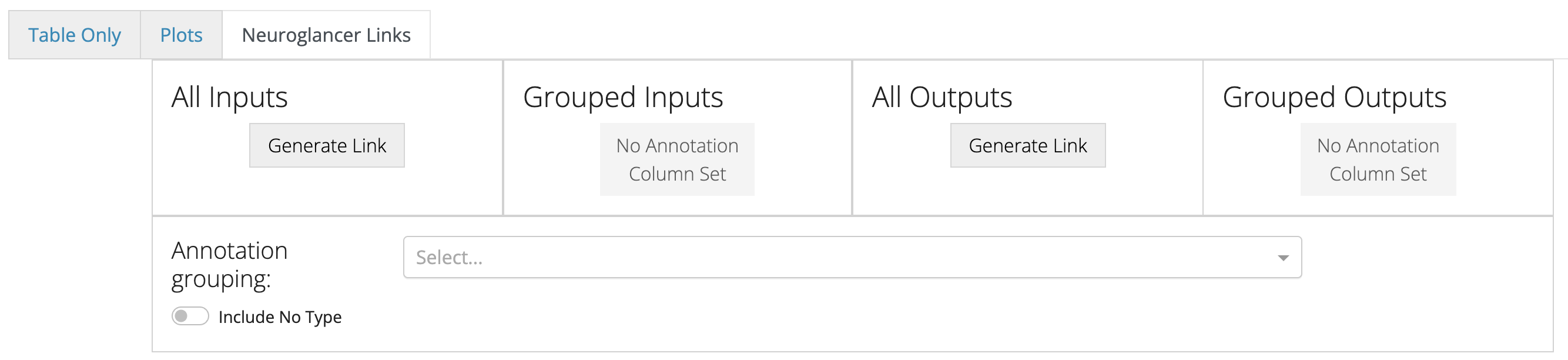
Include No Type toggle specifies whether to show synapses with cells that have no cell type annotation in the grouped cases.The Neuroglancer links generated by these buttons will span all synapses of the queried cell, and do not reflect the filtering in the table below. The synapse annotations are also associated with the synaptic partners, making it easy to browse through a broad sampling of synaptic connectivity.
Connectivity Table
The table below shows a table of all synaptic partners.
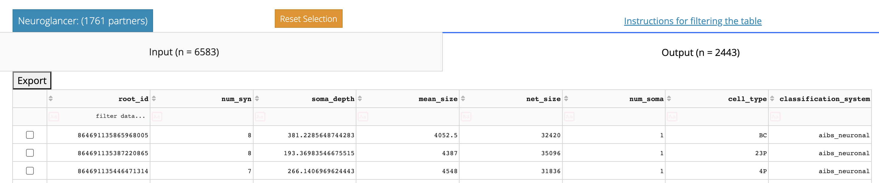
One of the first things you can see in the table viewer is that it is split into two tabs, Input and Output, with the tab names for each showing the total number of synapses in each category.
To move between them, just click the tab you want.
Above the Input/Ouput tabs is a link to the Neuroglancer view of the synapses show in the table, after filtering and/or selecting a subset of rows.
You also have the drop-down option to select which branch of neuroglancer to use: Seung-lab or Spelunker. If the annotations you expect are not rendering, try the other neuroglancer type.
The table view here is similar to in the Annotation Table Viewer described above. You can sort the table by clicking column headers, filter the table using the row underneath the headers, and select individual rows. If you select individual rows, the Neuroglancer link will group all synapses from each partner together, making it particularly easy to see how synaptic connectivity relates to neuronal anatomy.
The default sorting of the table is by total number of synapses, but note that both summed total synapse size (net_size) and average synapse size (mean_size) are also shown. These can be particularly important values when thinking about connectivity between excitatory neurons.
A CSV file of the entire table can be downloaded by clicking the “Export to CSV” button.